Data visualisation is, we are told, the hottest keyword in data science. Like many items of jargon fashionable in these modern times (just like the phrase ‘data science’ itself), its meaning is at best vague. The tech industry like to think of data visualisation as somehow computer-related, or the final stage of a process of computation and data manipulation which involves coding or the use of software tools. But human beings have been manipulating data and doing data science for millennia, so it follows that the history of data visualisation goes back a long way, long before computers were invented.
Consider graphs, the most common form of data visualisation. A graph is a visual representation of the relation between two variables (I mean the kind that’s plotted on a flat surface).
Who drew the first graph?
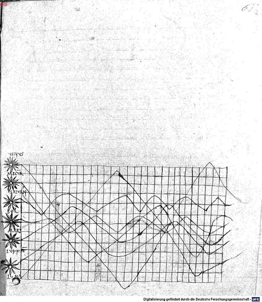
In 1936, Howard Gray Funkhouser described an image in a manuscript discovered by Siegmund Günther in 1877. The manuscript, a copy of Macrobius’s commentary on Cicero’s Somnium Scipionis, is located in the Bayerische Staatsbibliothek in Munich (BSB Clm 14436). It appears to date from the first quarter of the 11th century.
The graph is in the appendix, which bears the title De cursu per zodiacum (‘On the movement through the zodiac’). It was possibly added by an unknown transcriber. The graph seems to represent a plot of the inclinations of the planetary orbits as a function of the time. The zodiac is shown on a plane, with the horizontal axies showing time (divided into thirty parts), while the vertical axis shows the width of the zodiac.

The world’s first graph?
Folio 61 recto of a copy of Macrobius’s commentary on Cicero’s ‘Somnium Scipionis’. The lines show seven heavenly bodies: Venus, Mercury, Saturn, the Sun, Mars, Jupiter, and the Moon.
Is the the world’s first graph? The use of a grid is uncannily modern. But there are some difficulties.
Each line, belonging to a different planet, is plotted on a different scale, so the periods cannot be reconciled. It would be more accurate to call it a schematic diagram of the data. In other words, the values for the amplitudes which are described in the accompanying text, cannot be read off the graph.
A final note on data visualisation: Funkhouser’s research was motivated by the explosion in the use of graphical methods in the 1930s. That’s eighty years before DJ Patil popularised the term ‘data science’.
Leave a Reply