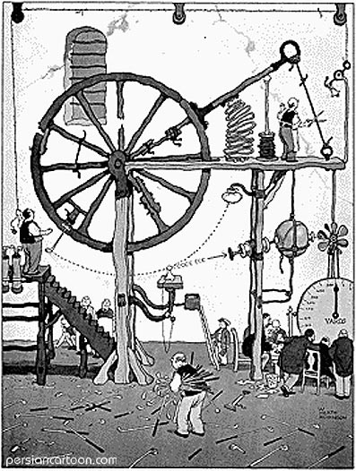
Awesome, perhaps. But what does it actually do?
A notebook of useful things
Awesome, perhaps. But what does it actually do?
The Economist has just published an interesting – and frightening – interactive map showing public debt across the world. It calls it the Global Debt Clock.
It makes for uncomfortable viewing. Here’s what it looks like on 4 September 2012 at 2143 GMT.
© 2025 Ivan Debono
Theme by Anders Norén — Up ↑